top of page
Adobe Summit
Project Type
Branding, Marketing and Promo Assets, Illustration (vector)
Date
Feb - Mar 2022
Program
Adobe Illustrator, Adobe InDesign, Adobe Photoshop
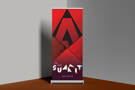
For this project, we had to pick and redesign an art conference. I decided to do mine over Adobe Summit. I had many ideas and drafts, and finally settled on this geometric design. The harsher colors matched the aesthetic of Adobe more than the pastel and gradients, and the shapes protruding out of the letters helped make the title of the summit
pop out a lot more. After the logo recreation, we had to create a conference program, digital ads, a poster, a sign up sheet, along with three additional touchpoints. I picked to do a water bottle, notebook, and a pop-up standing banner. This project was tedious. I went through constant changes and got helpful feedback to help strengthen and finalize my pieces.
Conference Program on Issuu


Iterations that did not make the cut


bottom of page
